

How to Choose Balloon Colors for Your Party to Set the Perfect Mood
Balloon colors do more than fill space. They tell guests what kind of party they’ve walked into before the music starts, before the cake comes out, and before anyone reads the welcome sign.
Soft blush, cream, and sage feel calm and sweet. Bright orange, hot pink, and yellow feel playful. Black, gold, and white feel polished. The shape of the balloons matters, sure, but color is what sets the emotional tone first.
That’s why choosing balloon colors deserves a little more thought than grabbing whatever looks cute in the store. You don’t need a design degree, either. A few simple rules can help you match your colors to the mood, theme, season, and venue so the whole party feels pulled together.

Start with the feeling you want guests to have
Before you pick a single balloon color, ask one question: What should this party feel like?
That sounds simple, but it’s the step people skip most often. They start with “I like blue” or “The store has gold,” then wonder why the decorations don’t match the vibe.
Color psychology isn’t magic, but it is useful. Designers, decorators, and event stylists often use color to guide emotion because people tend to associate certain color families with certain feelings. Warm colors usually feel energetic and social. Cool colors often feel calmer and more relaxed. Neutrals can make everything feel more refined or balanced.
Here’s a quick way to think about it:
Mood | Balloon colors that support it | Works well for |
Fun and high-energy | Hot pink, orange, yellow, lime, turquoise | Kids’ birthdays, summer parties, school events |
Soft and sweet | Blush, peach, lavender, cream, sage | Baby showers, first birthdays, bridal showers |
Elegant and polished | Black, white, gold, champagne, navy | Milestone birthdays, anniversaries, formal dinners |
Calm and natural | Olive, terracotta, beige, ivory, dusty blue | Garden parties, brunches, rustic celebrations |
Bold and dramatic | Burgundy, emerald, black, metallic gold, deep purple | Evening parties, themed events, holiday gatherings |
If you’re stuck, imagine the photos from the party. Do you want them to look bright and silly? Soft and dreamy? Fancy and grown-up? That picture in your head is your color direction.
This is also where Colors and moods for celebrations can help you make faster decisions. Instead of choosing colors one by one, choose the mood first, then build a palette that supports it.
Match balloon colors to your party theme without being too literal
A good theme gives you direction. A great color palette keeps that theme from feeling flat.
Let’s say you’re planning a dinosaur party. You could use only green balloons, but the setup might look one-note. Add tan, chocolate brown, ivory, and a little orange, and suddenly it feels more like a playful prehistoric scene.
The trick is to pull inspiration from the theme, then add depth.
Use the main theme color as your anchor
Pick one color that clearly connects to the party theme. This becomes your anchor color.
For example:
Mermaid party Aqua or teal
Princess party Pink, lavender, or soft blue
Space party Navy or black
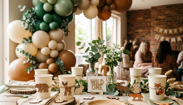
Woodland party Sage or forest green
Sports party Team-inspired colors, without needing every detail to match exactly
Once you have the anchor, choose two or three supporting colors. These keep the display interesting and help you avoid the “everything is the same color” problem.
Add neutrals to make bright colors easier to use
Bright colors are fun, but too many of them can feel chaotic. White, ivory, beige, gray, or clear balloons give the eye a place to rest.
For a rainbow party, for example, you don’t need equal amounts of red, orange, yellow, green, blue, and purple in every corner. Try using white as the base, then sprinkle rainbow colors throughout the balloon display. It’ll still feel colorful, but cleaner.
For a superhero party, instead of only red, blue, and yellow, add white or silver. The colors will still feel bold, but the overall look will photograph better.
Keep character themes flexible
If the party has character-inspired decor, use the character’s color palette loosely. You don’t have to match every shade perfectly.
A soft version of a character palette can feel more stylish, especially for younger kids’ parties where you want cute photos but still want the party to feel personal.
For example, if the theme uses bright primary colors, you could soften them into sky blue, cherry red, butter yellow, and white. Same idea, easier on the eyes.
Let the season guide your balloon palette
Seasonal color choices work because they already feel familiar. Guests don’t need to think about why terracotta and cream feel right in October or why yellow and white feel fresh in April. They just do.
You don’t have to follow seasonal colors exactly, but they’re a helpful starting point.
Spring parties feel fresh with soft or garden-inspired colors
Spring palettes usually look best when they feel light and airy.
Try:
Lavender, mint, pale yellow, and white
Blush, peach, sage, and ivory
Sky blue, daisy yellow, and cream
Lilac, soft green, and pearl white
These colors work especially well for baby showers, garden birthdays, Easter gatherings, and brunch parties.
If you’re using florals, pull balloon colors from the flowers. If the centerpiece has pale pink roses, greenery, and white blooms, use blush, sage, and white balloons to echo the table.
Summer parties can handle brighter colors
Summer light is strong, especially outdoors. That means bold balloon colors usually look great.
Try:
Coral, turquoise, yellow, and white
Hot pink, orange, and peach
Lime, aqua, and white
Red, white, and blue for patriotic summer gatherings
For pool parties, aqua and white are easy wins. Add coral or yellow if you want more energy. For tropical parties, green, pink, orange, and yellow work well, but keep one neutral in the mix so it doesn’t get too busy.
Fall parties look cozy with earthy tones
Fall palettes feel best when they include warmth.
Try:
Terracotta, mustard, cream, and olive
Rust, burgundy, blush, and champagne
Chocolate brown, tan, ivory, and burnt orange
Plum, copper, and soft beige
These colors are great for fall birthdays, pumpkin-themed parties, harvest dinners, and outdoor celebrations.
If you’re worried fall colors will look too dark, add ivory or peach. It brightens the whole setup without losing the cozy feeling.
Winter parties can be soft, sparkly, or dramatic
Winter gives you a lot of room to play. You can go icy and elegant, warm and festive, or bold and moody.
Try:
White, silver, and icy blue
Emerald, gold, and cream
Burgundy, blush, and champagne
Navy, white, and metallic gold
Black, silver, and pearl white
For holiday events, try using one traditional color with one unexpected color. Red and green are classic. Red, blush, and champagne feel softer. Green, ivory, and gold feel polished.
Pay attention to the venue before you commit
The same balloon colors can look totally different depending on the space. Lighting, wall color, ceiling height, flooring, and furniture all affect how your balloons look.
This is why a palette that looks perfect online can feel off once it’s in your living room, backyard, or rented hall.
Look at the background color
Balloons need contrast. If the venue has white walls, almost any palette works. If the walls are dark wood, tan, or brick, very pale colors may disappear. If the space has colorful carpet or patterned wallpaper, a simpler balloon palette usually looks better.
Try this simple test: hold your balloon colors, or paper swatches, against the wall where the display will go. If they blend in too much, add contrast.
For example:
White wall Use pastels, brights, neutrals, or dark colors.
Brick wall Try cream, blush, sage, navy, or gold.
Wood fence Use white, peach, sage, lavender, or bright colors.
Dark backdrop Use white, metallics, light pink, pale blue, or jewel tones.
Think about lighting
Warm light makes colors look more golden. Cool light can make colors look sharper or slightly blue. Outdoor daylight shifts during the day, too.
If your party starts in the afternoon and continues into the evening, choose colors that work in both natural and artificial light. Ivory, blush, sage, navy, gold, white, and soft blue are usually safe choices.
Clear balloons and metallic balloons can reflect light beautifully, but use them with care. Too many shiny surfaces can create glare in photos.
Match the scale of the space
Small space, smaller palette. Large space, bigger contrast.
In a living room, two or three colors may be enough. In a large hall or outdoor pavilion, a palette with four or five shades often looks fuller and more intentional.
A large Balloon Garland can handle a mix of sizes and colors, especially if you group colors in clusters instead of scattering every color evenly. This creates flow and keeps the design from looking speckled.

Use popular balloon color combinations the smart way
Some color combinations stay popular because they work across many occasions. The key is knowing how to use them so they feel intentional, not copied.
Blush, cream, and gold feel soft and pretty
This palette works for baby showers, bridal showers, tea parties, first birthdays, and sweet sixteen parties.
Use blush as the main color, cream to soften it, and gold as the accent. Gold works best in smaller amounts. Think small clusters, a few metallic balloons, or a gold number balloon.
Too much gold can overpower the softness.
Sage, ivory, and terracotta feel natural and warm
This combo is perfect for boho parties, fall gatherings, outdoor birthdays, and neutral baby showers.
Use ivory as the base, sage as the calming color, and terracotta for warmth. Add dried flowers, wood details, or linen tablecloths if you want the whole setup to feel cozy.
Navy, white, and gold feel classic
This is a strong choice for milestone birthdays, graduations, anniversaries, and evening events.
Use navy to create depth, white for contrast, and gold for celebration. If the room is already dark, use more white so the display doesn’t feel heavy.
Rainbow with white feels cheerful without feeling crowded
Rainbow balloons are perfect for kids’ birthdays, art parties, school celebrations, and pride-themed gatherings.
The cleanest approach is to use white as the base and add rainbow colors in sections or clusters. You can also arrange the colors in order for a more playful look.
If you use every color evenly throughout the whole display, it can look busy. Grouping the colors gives the eye a path to follow.
Black, white, and silver feel modern
This palette works well for New Year’s Eve parties, teen birthdays, milestone birthdays, and formal celebrations.
Use black and white as the base, then add silver for shine. For a softer version, swap black for charcoal or add clear balloons.
Pink, orange, and yellow feel bold and happy
This combo is great for summer birthdays, pool parties, dance parties, and bright kids’ celebrations.
Use one color as the star, then let the others support it. For example, choose hot pink as the main color, orange as the second color, and yellow as the accent. This keeps the palette exciting without turning messy.
Balance your palette like a decorator
Here’s a simple design rule that works almost every time: use the 60-30-10 idea.
That means:
60 percent main color
30 percent secondary color
10 percent accent color
You don’t need to measure every balloon. Just use it as a guide.
For a blush, cream, and gold party, that might mean mostly blush balloons, plenty of cream, and a few gold accents. For a navy, white, and gold graduation party, it might mean mostly navy, lots of white, and a little gold.
This rule helps because accents look more special when they’re used sparingly.
Mix finishes for more depth
Balloon colors look more interesting when you mix finishes. Matte balloons feel modern and soft. Pearl balloons add a gentle shine. Metallic balloons feel festive. Clear balloons add lightness.
Try mixing one or two finishes instead of using all of them at once. For example, matte sage and ivory with a few pearl champagne balloons can look lovely. Matte black, white, and silver metallic can feel sleek.
Vary the shades, not just the colors
A display with five shades of pink can look more polished than a display with five unrelated colors.
Try:
Blush, rose, mauve, cream, and champagne
Sky blue, dusty blue, navy, white, and silver
Mint, sage, olive, ivory, and tan
Using tints and shades creates depth while keeping the palette calm.
Repeat colors around the party
Your balloon colors shouldn’t feel like they belong to one corner only. Repeat them in small ways across the party.
That could mean:
Napkins that match the accent balloon color
Cupcake toppers in the same shade as the main balloons
A table runner that picks up a neutral from the balloon display
Treat bags tied with ribbon in one of the palette colors
You don’t need everything to match perfectly. Repetition is enough.

Make room for personal style
Party color rules are helpful, but they’re not here to boss you around. The best parties usually have something personal in the palette.
Maybe your child wants purple, even though the theme is outer space. Great. Use deep purple with navy, silver, and white. Maybe the guest of honor loves green. Build the whole palette around emerald, sage, or mint. Maybe you’re tired of pink for a baby shower. Use peach, ivory, cinnamon, or dusty blue instead.
Personal color choices make a party feel less like a template and more like a celebration.
If you’re nervous about unusual colors, start small. Use one unexpected accent color with two safer colors.
Try these creative twists:
Add lavender to a dinosaur party for a softer look.
Use rust and blush for a fall birthday instead of orange and black.
Pair aqua with coral for a beach party that feels bright but not too themed.
Use chocolate brown, cream, and pale pink for a sweet dessert-inspired party.
Mix sage, butter yellow, and white for a gender-neutral baby shower.
The most memorable palettes often come from a real preference, a favorite outfit, a piece of artwork, a flower arrangement, or even a favorite dessert.
Choose with confidence and keep it fun
Choosing balloon colors gets easier when you work in this order:
Pick the mood.
Use the theme for direction.
Check the season.
Look at the venue.
Choose one main color, one or two supporting colors, and one accent.
Repeat those colors in small details around the party.
If you want a simple starting point, choose three colors. That’s enough to create interest without making the setup feel too complicated. For a bigger event, add a fourth shade or a metallic accent.
The goal isn’t a perfect color palette. The goal is a party that feels like it belongs to the person or occasion you’re celebrating.
Ready to start matching balloons, tableware, and party extras? Browse party supplies and decorations for your next celebration and build a color palette that feels just right.
Whether you go soft and sweet, bright and playful, or bold and dramatic, trust your eye. If the colors make you smile when you see them together, that’s a pretty good sign your guests will feel it too.
Comments